Designers
The Principles of Design (With Examples and Infographic)
A 2026 field guide to the twelve principles of design for graphic designers. Contrast, balance, hierarchy, rhythm, white space, and motion — how each one fails, how to fix it, and how to encode it in type, color, accessibility, and design systems.
Sanif Sultan
October 2, 2026 · 8 min read

As of October 2026, most of the layouts that fail still fail for the same reasons they failed in print: the eye has nowhere to land, related things do not sit together, and the important thing does not look important. What changed is the cost of getting that wrong. Interfaces are generated, themed, translated, dark-mode flipped, and reduced-motion stripped in the same week. A principle that only lives in a moodboard does not survive that. A principle encoded as a decision — a contrast floor, a type scale, a motion token — does.
This is a working guide to the twelve arrangement principles designers still use, rewritten for screens, systems, and the tools now sitting next to the canvas. Elements (type, color, shape, line) are the materials. Principles are how you arrange them.
Contrast
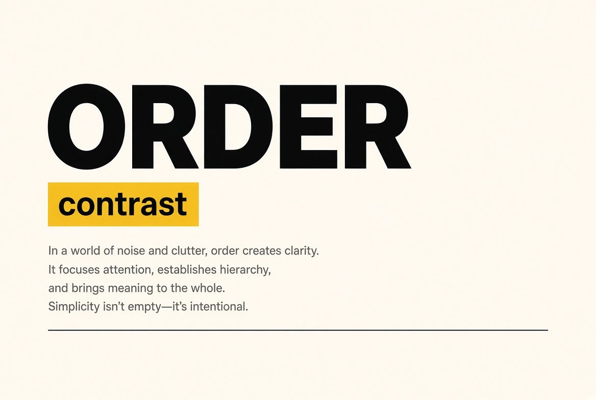
Contrast is the difference that makes one thing separable from another. Size, weight, value, hue, texture, and sharpness all create it. Without enough of it, nothing registers. With too much of it everywhere, nothing ranks.
In practice, contrast does two jobs that should not be confused. The first is perception: can someone actually read this? WCAG 2.2 still sets the floor most teams ship against — 4.5:1 for normal text, 3:1 for large text (18pt / 24px regular, or 14pt / 18px bold) and for UI components and meaningful graphics. AAA asks for 7:1 on body text when the product can afford it. Color alone never carries meaning; pair it with weight, shape, or a label. The second job is rank: the one accent that is loud should be the one action that matters. A palette of five competing brights is not contrast. It is noise.
2026 tooling made the first job cheaper. Contrast checkers, color-blindness simulation, and design tokens that fail a build when a pair drops below the ratio are standard in serious systems. The second job is still judgment. Bold minimalism — sparse layouts with one saturated hit — works because the contrast is rationed.
Balance
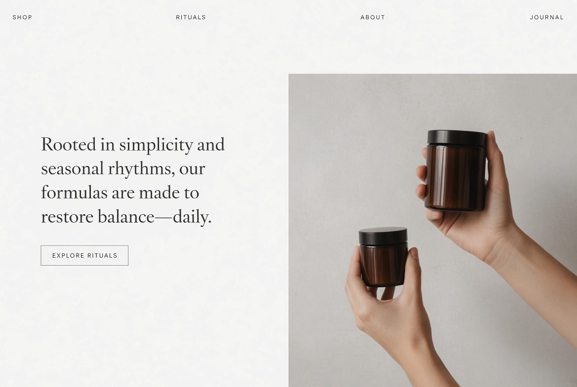
Balance is the distribution of visual weight so a composition feels stable, not stuck. Weight comes from size, darkness, saturation, density, and position. A small black mark near the edge can counter a large pale field near the center.
Symmetrical balance mirrors weight across a center line. It reads formal, calm, and institutional — useful for certificates, luxury packaging, and any screen that should feel trustworthy at a glance. Asymmetrical balance uses unequal masses arranged so the tension still resolves. It reads more alive, and it is the default of most contemporary web and editorial work. Radial balance organizes weight around a point; it shows up in dashboards, badges, and any composition built on a circle.
A quick test: cover half the layout. If the remaining half feels like it will tip, the weights are not resolved. In component systems, balance is also a responsive problem. A hero that is balanced at 1440px often collapses into a top-heavy stack at 390px unless the image weight and the type weight are redesigned for the narrow column, not merely reflowed.
Emphasis
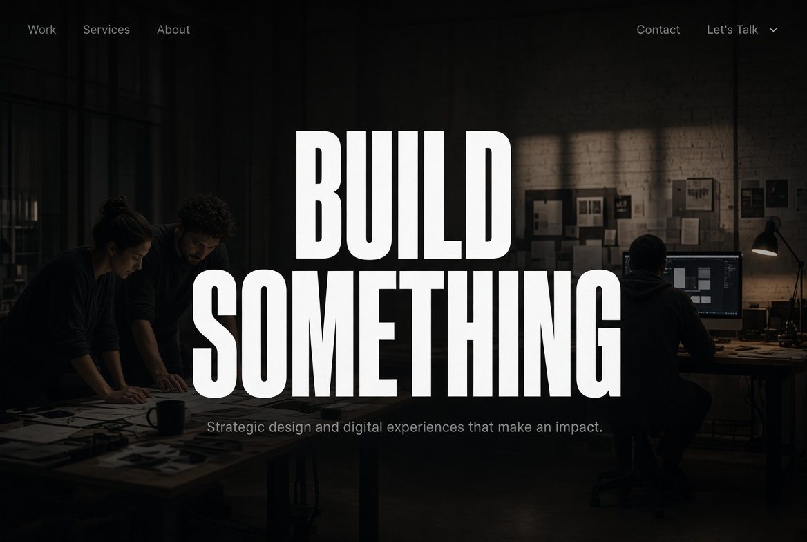
Emphasis is the deliberate decision about what stands out — and, equally, what does not. Every layout has a focal point. If you do not choose it, the viewer’s eye chooses the loudest accident.
You build emphasis with isolation, scale, contrast, and position. The upper-left and the optical center still attract first glances in left-to-right cultures; the Z and F scanning patterns still describe how people skim text-heavy pages. Isolation is underused: one object in a field of quiet space is louder than the same object covered in badges.
De-emphasis is the other half of the skill. Legal lines, metadata, and secondary navigation should be present and findable, not competitive. Tiny type at the foot of a page is a legitimate tool, provided it still clears the contrast floor. In 2026 product work, emphasis also has to survive personalization. If an AI surface promotes a different module per user, the system needs a rule for which slot is allowed to be the hero — otherwise every card screams.
Proportion
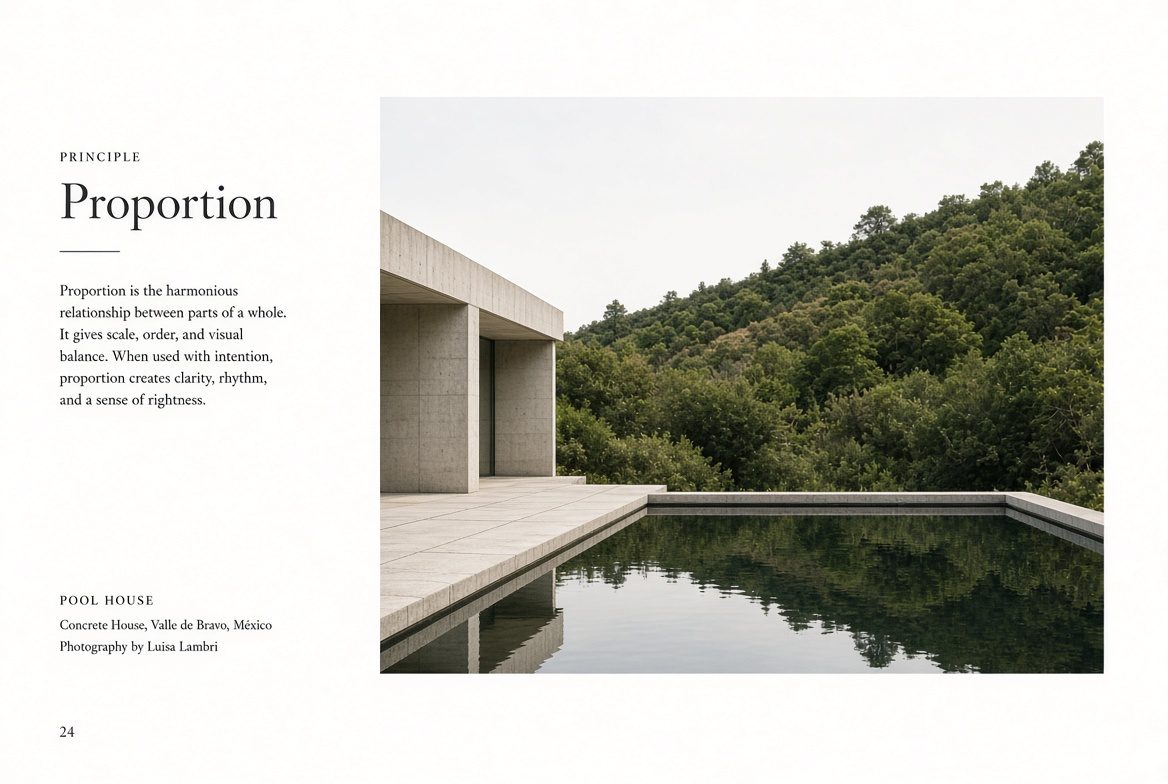
Proportion is the size of elements relative to each other, and relative to the frame. It is the simplest hierarchy tool available: larger reads as more important, smaller as supporting, until you deliberately break that expectation.
Classical ratios — the golden section, root-2, a modular scale such as 1.25 or 1.333 — still produce type ramps that feel inevitable rather than picked. A practical scale for UI is something like 12 / 14 / 16 / 20 / 28 / 40 / 64, with line length held near 45–75 characters. Proportion also governs image-to-text relationships. A full-bleed photograph beside a narrow column of type says the picture is the argument and the words are the caption. Reverse that and the words lead.
Fluid type and container queries changed the craft in the last few years. Proportion is no longer a single artboard decision. Define the relationship (this headline is roughly 2.5× the body, this image is roughly 60% of the content width) and let the viewport negotiate the absolute sizes. What fails is a headline that is enormous on desktop and merely bold on a phone, so the intended rank disappears.
Hierarchy
Hierarchy is the order in which information should be processed. Proportion is one input. Hierarchy is the full system: type rank, weight, color, spacing, position, and sequence working together so a stranger can answer “what is this, and what do I do?” in a few seconds.
Three levels are usually enough. Primary: the title or the one action. Secondary: section headings and supporting proof. Tertiary: meta, captions, legal. If you need six levels, the content structure is probably the problem, not the type styles. Group related items (Gestalt proximity and common region) so the eye reads clusters, not a field of equal cards.
Sfeerze · for designers
Put the work where clients can find it.
Sfeerze is a freelance marketplace with a skill feed, per-minute Zoom calls, and jobs paid through wallet escrow. Share a project, take a critique call, or get hired on a funded brief.
Open SfeerzeOn the web, hierarchy is also a document outline. The visual H1 should be the semantic H1. Skipping heading levels, or styling a div to look like a title, breaks the same order for anyone using a screen reader. In dense product UI — tables, inboxes, analytics — hierarchy is how you keep a screen from becoming a spreadsheet in costume: one number large, the comparison small, the action quiet until needed.
Repetition
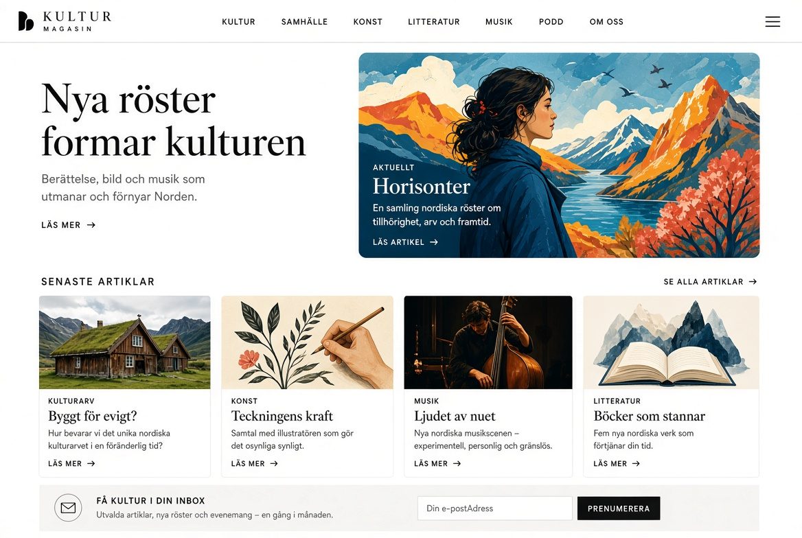
Repetition is the reuse of a visual decision — a color, a type style, a corner radius, a spacing step, an icon weight — so separate parts read as one system. It is the principle behind brand recognition and behind every design system that actually gets used.
Repeat structure, not just decoration. The same heading treatment on every principle in an article tells the reader those sections are peers. The same card padding, the same button height, the same link color tells a user the interface is one product. Inconsistency is not personality; it is a tax on recognition.
The 2026 failure mode is accidental repetition from generative tools. Models love a house style and will repeat it until every brand on a landing page looks related. Deliberate repetition means a small set of tokens you chose, applied without drift, and broken only when you mean to create emphasis.
Rhythm
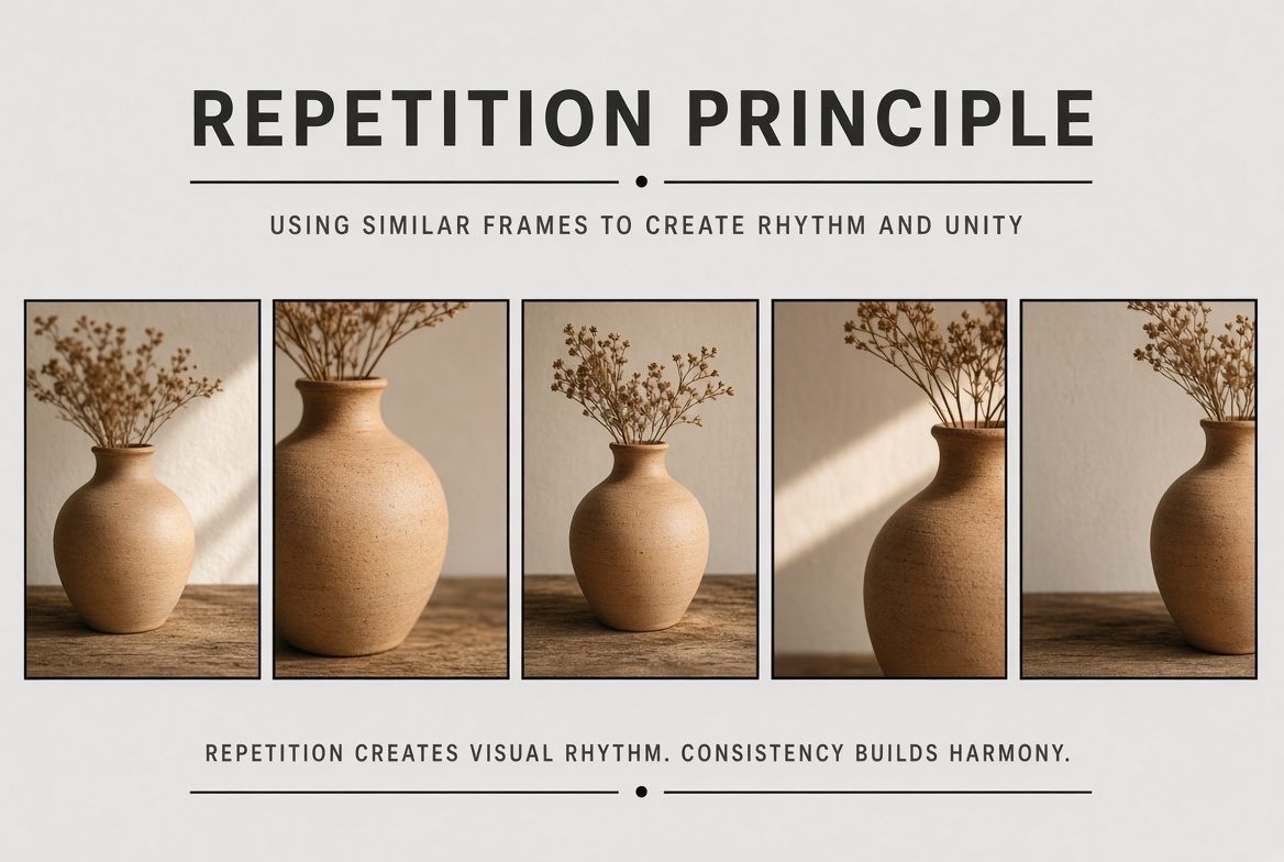
Rhythm is repetition plus interval. The gaps are the beat. Regular rhythm uses equal spacing and feels orderly, almost architectural. Alternating rhythm swaps two measures (image, text, image, text). Flowing rhythm follows curves and organic spacing. Progressive rhythm changes by a rule — each step larger, each gap wider — and creates a sense of acceleration. Random rhythm has no readable rule; used rarely, it can feel human, and used carelessly it feels unfinished.
In interface design, vertical rhythm is the practical version: a baseline grid or a spacing scale (4, 8, 12, 16, 24, 32, 48) so type and components land on the same pulse. Motion extended this. Duration and easing are rhythmic too. Micro-interactions around 100–200ms, larger transitions around 300–500ms, spring curves instead of linear, and a prefers-reduced-motion path that keeps the information while dropping the travel. Motion that cannot explain what it communicates is decoration, and decoration at scale becomes fatigue.
Pattern
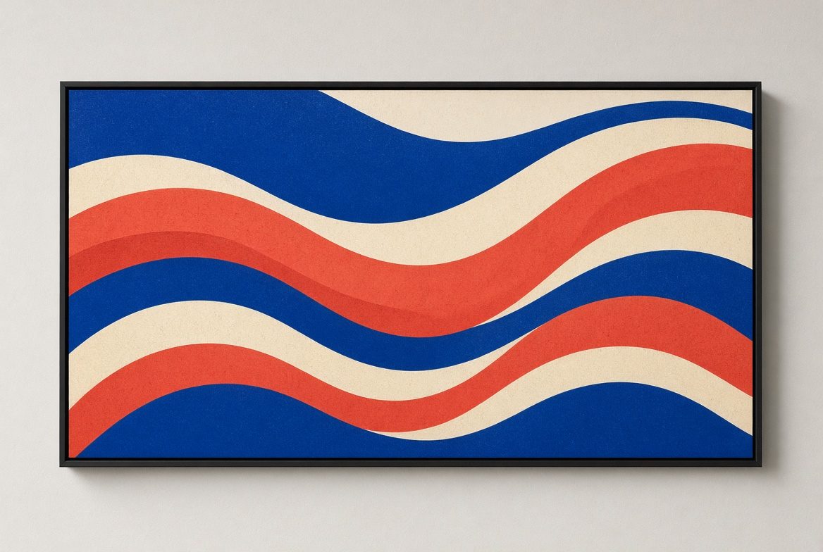
Pattern is repetition complex enough to become a field: wallpaper, a textile, a navigation model people already know how to use. Some patterns are decorative. The useful ones are conventions. Top navigation, a card grid, a search field at the start of a list, a sticky primary action — these are patterns because they transfer learning from one product to the next.
Invent a pattern only when the convention cannot carry the task. A custom gesture that replaces a visible control looks clever in a prototype and fails in a usability test. Decorative pattern, by contrast, is having a moment as a counter to flat, textureless AI output: grain, misregistration, halftone, and hand-drawn repeats that make a surface feel made. Keep it out of the text column. Pattern behind type destroys the contrast you just earned.
White space
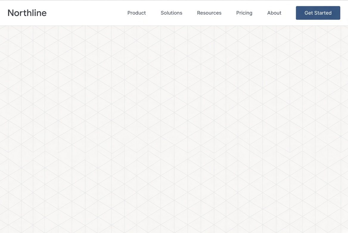
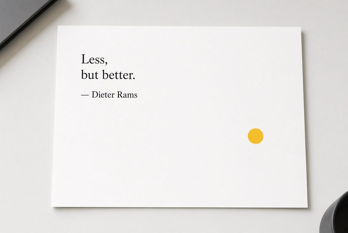
White space — negative space — is the unmarked area. It is not leftover. It is an active material that separates groups, sets rank, and signals confidence. Crowded layouts feel anxious. Empty layouts feel considered, until they feel unfinished. The difference is whether the emptiness is structured.
Macro white space is the margin around a composition and the air between sections. Micro white space is the space inside type: leading, tracking, the counters of letters. Body text set tight is harder to read than the same text with leading around 1.4–1.6, because the eye loses the line. Negative space can also draw a second image — the arrow between the E and x in FedEx is the classic case — but hidden pictures are a bonus, not a strategy.
Calm UI, one of the clearer 2026 currents, is mostly a white-space argument: fewer choices per view, more room around the one that matters, motion used to explain a change rather than to fill silence. Beginners still fear the empty region. The fix is to delete before you decorate.
Sfeerze · hire a designer
Need a logo pass, or a full brief?
Book a graphic designer for a live Zoom call and pay by the minute, or post the job and hire with escrow. Same marketplace, two ways to start.
Find a graphic designerMovement
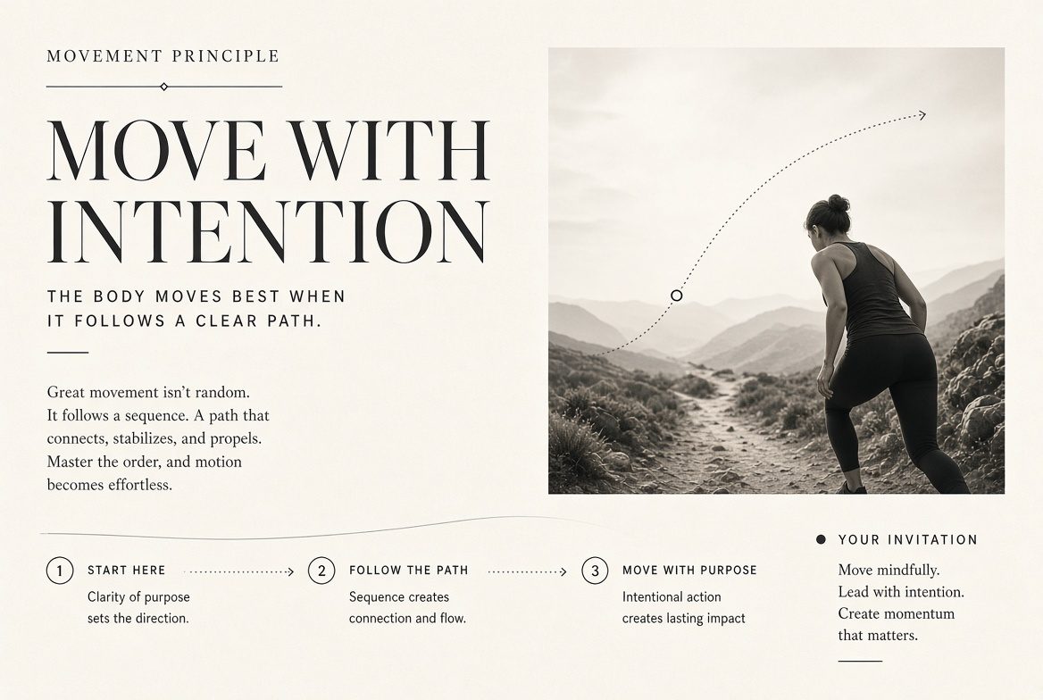
Movement is the path the eye takes, and in digital work, the path elements take when state changes. In a static layout you steer it with weight, contrast, and alignment: the heaviest thing first, then the next contrast, then the quiet detail. Lines, gazes in photography, and edges that point all act as arrows.
In product UI, movement has a job description. It confirms an action, shows where something went, and keeps spatial context during a transition. Spring physics — mass, stiffness, damping — replaced a lot of fixed 300ms easings because the settle feels physical. Hierarchy applies here too: one primary motion, secondary elements following with a short delay. Always ship a reduced-motion alternative. Vestibular disorders are common enough that a layout which only works when things fly is a broken layout.
People still scan in F and Z patterns on text-heavy pages. Design the path on purpose, then check it by squinting. If the bright spots do not form a route, the movement is accidental.
Variety
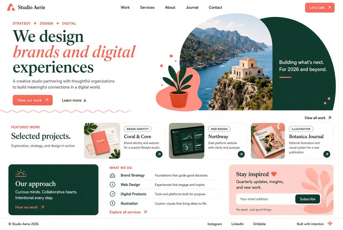
Variety is controlled difference. Without it, repetition becomes a wall. With too much of it, the system dissolves. The working range is small: one or two type families, a tight color set, a shared grid, and then differences that mean something — a shift in scale, a second texture, an illustration where everything else is photography.
Variety is also how brands avoid the generic look of unedited generative output. Imperfection, grain, a slightly irregular hand-drawn mark, a retro-future accent against a strict grid: these read as authored when they are rationed. A page that changes type, color, radius, and illustration style in every section does not feel creative. It feels unresolved. Use variety to support hierarchy (the different thing is the important thing) or to mark a change of section, not to keep yourself entertained.
Unity
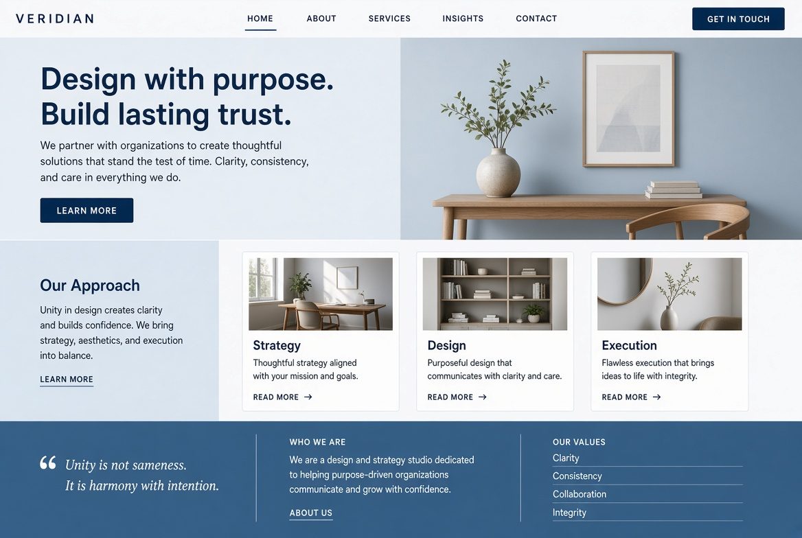
Unity is the sense that every part belongs to the same piece of work. It is the sum of the other principles used with restraint: shared alignment, a repeated color logic, proportional relationships, a single rhythmic spacing scale. When unity holds, the viewer does not have to relearn the page at every scroll.
Harmony is the tonal version of the same idea — elements agreeing in mood, not only in structure. A layout can be structurally unified and still feel split if the photography is cold and the type is playful. Alignment and a grid are the fastest routes to unity. Breaking the grid is then a meaningful event, which is why it only works after the grid is visible.
Design systems are unity industrialized. Tokens for color, type, space, radius, and motion mean a second team, or a model generating variations inside constraints, cannot casually invent a new dialect. The craft left for the designer is knowing when a local break serves emphasis and when it is drift.
The materials underneath
Principles arrange materials. Four of those materials do enough work to treat as part of the same practice.
Typography is hierarchy you can read. A restrained pair — one for voice, one for interface, or a single variable family with a clear optical size axis — beats a drawer of display faces. Set a modular scale, cap line length, and do not justify narrow columns. Variable fonts made fluid type practical; use them for that, not for five weights on one screen.
Color is contrast, mood, and wayfinding. Blues still read as calm and institutional, warm earth tones (the mocha-and-clay range that dominated late 2025 palettes) read as material and human, saturated accents read as action. Build the palette from the contrast pairs outward, including a dark theme and a high-contrast theme, not as an afterthought. Never let hue be the only signal.
Gestalt grouping — proximity, similarity, common region, continuity, closure — is why a cluster of cards feels like one idea and a gap feels like a new section. Design the gaps on purpose. Grids and alignment are the measuring system under all of this. An 8-point spatial grid plus a column grid will diagnose more “it feels off” layouts than another round of decoration. Framing, crop, and shape do the emotional work before the first word is read: a tight crop feels intimate, a circle feels softer than a sharp triangle, a wide margin feels distant and formal.
A diagnostic you can actually use
When a layout feels wrong, name the failure before you restyle it.
- Cannot tell what matters: hierarchy and emphasis. Enlarge one thing, quiet two others.
- Feels tipped or cramped: balance and white space. Move weight, or remove it.
- Feels random: repetition and rhythm. Put spacing and type back on a scale.
- Feels monotonous: variety, but only one kind.
- Feels like several brands: unity. Cut the palette and the type to a system.
- Looks fine, fails in use: contrast and movement. Check ratios, and check that motion still communicates with reduced motion on.
Freelance, but social.
Skill in. Income out.
On Sfeerze, experts post work to a feed, take paid calls by the minute, and deliver jobs funded in escrow. Clients book the minutes they need, or hire when the scope is clear.
Go to SfeerzeAI is useful upstream of that list and dangerous in the middle of it. It is good at producing options inside constraints you set — ten crops, five palette ramps that already pass 4.5:1, a first pass at alt text. It is bad at deciding which constraint matters. The designers shipping durable work in 2026 are the ones who can state the principle in a sentence a token can enforce, and who still know when to break it.
The principles are not a style. They are the reasons a style holds together after the trend — glass, grain, brutalist type, calm UI — has moved on.