Design
Color Theory, Without the Abstract Lecture
Understand color theory without the abstract lecture. Learn how RGB and CMYK work, explore the color wheel, tints, shades, and tones, and use complementary, analogous, and triadic schemes to create stronger branding, interfaces, and designs.
Sanif Sultan
October 15, 2026 · 8 min read

Color theory is the practical system that explains how colors interact, why some combinations feel right and others fight, and how to use that knowledge so people notice, trust, and remember what you make.
Most people decide whether they like something in under 90 seconds, and the majority of that judgment is color. That is not marketing folklore. It shows up in packaging tests, website heat maps, and the simple fact that you can spot a Coke can from across a grocery aisle before you read the logo. The red is doing more work than the script type.
This guide walks through the fundamentals you actually use as a designer, brand owner, or freelancer who has to make things look intentional. No pure theory for its own sake. Each section includes a visual and a real-world application.
1. How Color Actually Works: Light Versus Pigment
Your eyes do not “see” color the way a camera sensor records it. Objects absorb some wavelengths of light and reflect others. Your brain translates those wavelengths into the experience of red, blue, or yellow. Screens and printed objects create that experience in opposite ways.
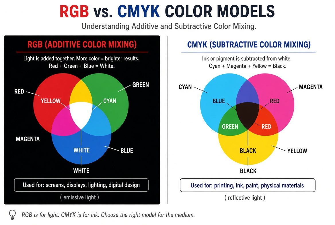
Screens use the additive model. They start dark and add light. Red, green, and blue light mixed at full intensity produce white. That is why RGB is the native language of websites, social posts, app interfaces, and anything that glows.
Printed materials use the subtractive model. They start with white paper (or a white substrate) and subtract light by laying down ink. Cyan, magenta, yellow, and black (CMYK) absorb wavelengths so the remaining light reflects back as the color you see. Mixing all three process colors theoretically produces black, but real printers add a separate black channel because the mix is muddy.
Practical consequence. A bright yellow logo that looks perfect on your laptop will often print dull or olive if you send an RGB file to a printer. Export screen assets in RGB and print files in CMYK (or the specific profile the printer requests). Most design software lets you switch color modes; do it before final export.
2. The Color Wheel and Why It Still Matters
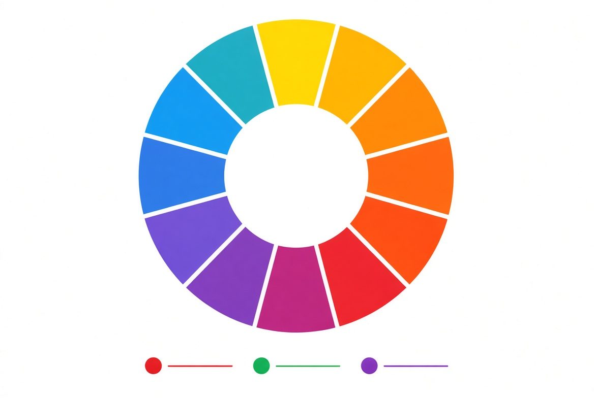
Sir Isaac Newton arranged the visible spectrum into a circle in 1666 so relationships between colors became visible. The modern wheel used by designers still does the same job.
Primary colors cannot be mixed from other colors. In traditional pigment (RYB) they are red, yellow, and blue. Secondary colors come from mixing two primaries: orange, green, purple. Tertiary colors sit between them (red-orange, yellow-green, and so on).
A line through the wheel separates warm colors (reds, oranges, yellows) from cool colors (blues, greens, purples). Warm colors tend to advance and feel energetic. Cool colors recede and feel calmer. Choosing a predominantly warm or cool palette changes the emotional temperature of a brand or interface before any copy is read.
Nature supplies the clearest examples. A sunset uses warm analogous colors. A forest understory uses cool greens and blues. The wheel simply maps those relationships so you can recreate them deliberately.
3. Hue, Tint, Shade, and Tone
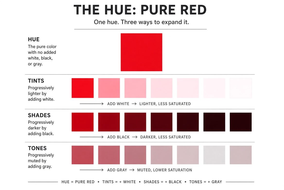
Hue is the pure color itself—red, blue, yellow-green. Once you have a hue, you modify it in three common ways:
- A tint adds white. Red plus white becomes pink.
- A shade adds black. Red plus black becomes burgundy or maroon.
- A tone adds gray (or both black and white). The result is muted and more sophisticated.
These variations let you build depth without introducing new hues. A brand can own a single hue and still create hierarchy by using tints for backgrounds, the pure hue for accents, and shades for text or shadows.
Most successful brand systems are not rainbows. They are controlled variations of one or two hues plus neutrals. That is why a well-built monochromatic palette often feels more expensive than a random collection of saturated colors.
4. Complementary Colors: Maximum Contrast
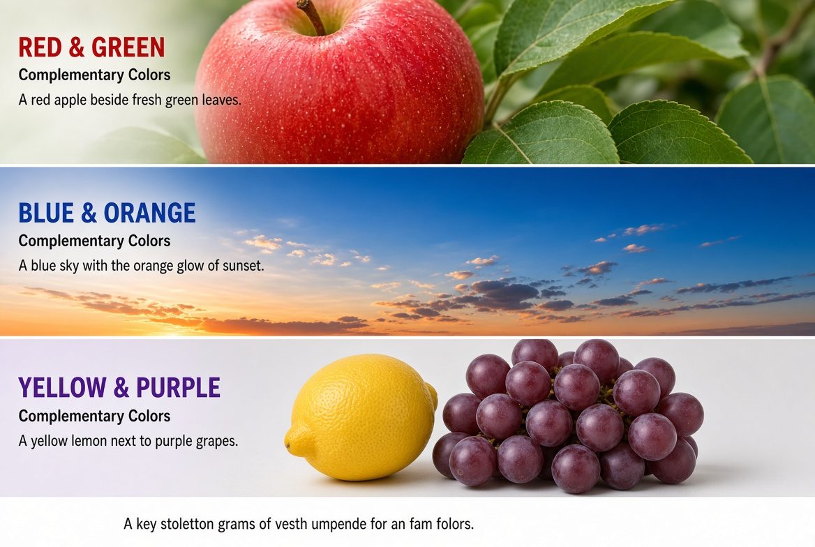
Complementary colors sit opposite each other on the wheel (red/green, blue/orange, yellow/purple). They create the strongest contrast and make each other appear more intense. Used in equal saturated amounts they can vibrate and tire the eye; used with one dominant color and the complement as a small accent, the effect is powerful and attention-grabbing.
This relationship is useful for differentiation and call-to-action elements. Color contrast is also one of the core ideas in the principles of design, where hue and value contrast help establish hierarchy and emphasis.
5. Analogous Colors: Harmony and Direction
Analogous colors sit next to each other on the wheel—blue, blue-green, green, or red, red-orange, orange. They share a common hue range, so they feel related and calm. Nature uses them constantly: autumn foliage, ocean gradients, desert sunsets.
The practical rule is to pick one dominant hue, one supporting neighbor, and one accent. Equal weight across three analogous colors usually feels flat. The accent can be a slightly more saturated version of one of the three, or a small complementary note introduced sparingly.
Many food and wellness brands use analogous schemes because they feel approachable and cohesive. Navigation bars, hero sections, and packaging often rely on them so the eye moves smoothly rather than jumping.

6. Triadic Colors: Balanced Energy
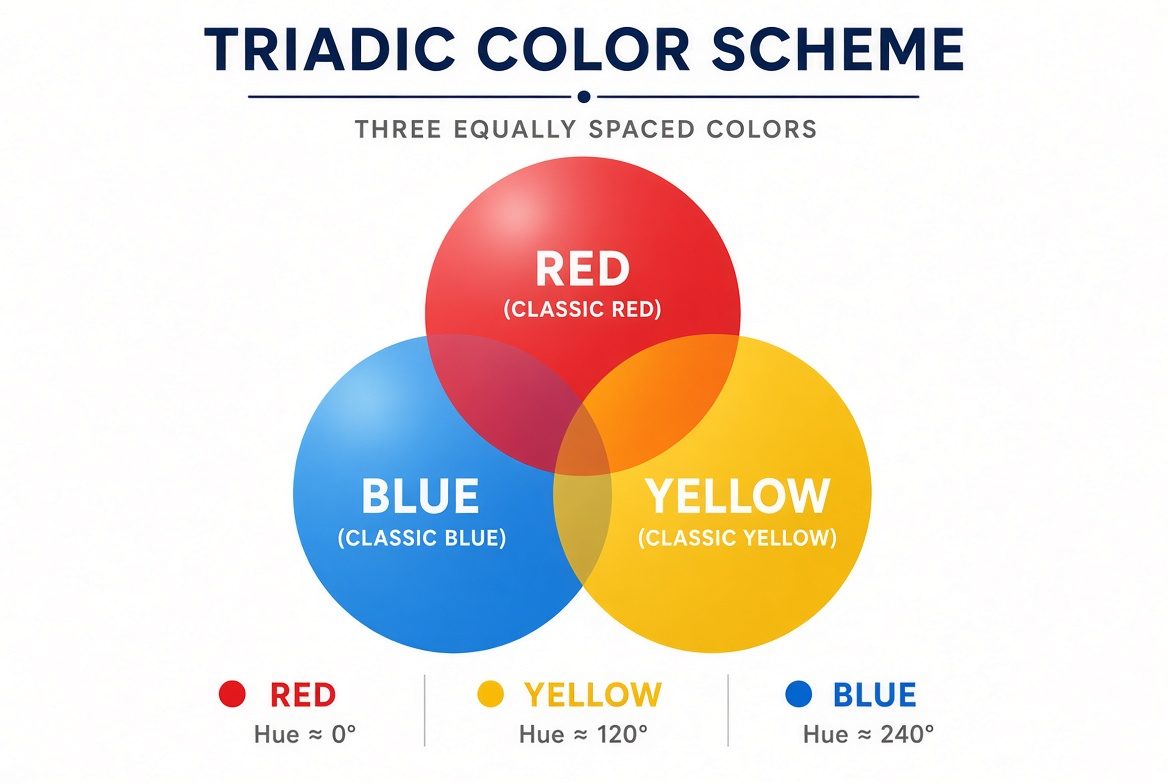
Triadic schemes use three colors equally spaced around the wheel (120 degrees apart). The classic primary triad is red, yellow, and blue. Another common one is orange, green, and purple.
Because the colors are equidistant, the scheme feels vibrant yet balanced. One color usually dominates, the second supports, and the third accents. Burger King’s red, yellow, and blue packaging is a long-running commercial example. Children’s products, illustrations, and playful brands often use triads because the energy stays high without the vibration of pure complements.
Triads work well when you need visual interest across multiple elements (icons, illustrations, section backgrounds) but still want the overall composition to feel intentional rather than chaotic.
7. Putting It to Work in Branding and Interfaces
Color theory becomes useful the moment you apply it to a specific job: a logo, a website, packaging, or a social feed. The same principles that organize the wheel also support hierarchy, emphasis, and unity—core ideas covered in more detail in the principles of design guide. Contrast is not only a size or weight decision; hue and value contrast determine whether a button is readable and whether a logo survives at small sizes.
A practical sequence most designers follow:
- Decide the medium first (RGB for screens, CMYK or spot colors for print).
- Choose one dominant hue that matches the emotional tone you want.
- Build supporting colors from the wheel (analogous for calm, complementary or triadic for energy).
- Create tints, shades, and tones so you have usable values for backgrounds, text, and accents.
- Test contrast, especially for text and interactive elements. Color alone should never be the only signal.
Real brands demonstrate the results. Cool blues dominate financial and healthcare sites because they read as stable. Warm earth tones and oranges appear frequently in food and lifestyle brands because they feel approachable. Saturated complementary accents draw the eye to purchase buttons or limited-time offers.
For freelancers building a visual identity, the same rules apply to your own presence. A consistent color system across your skill feed, proposals, and portfolio makes the work look intentional rather than assembled. That visual consistency supports the larger work of building a personal brand people remember—starting with clear positioning and proof, then reinforced by the materials you show.
For freelancers, the same principles apply to your own presence. A consistent color system across your skill feed, proposals, and portfolio makes the work look intentional. That visual consistency supports the larger process of building a personal brand that people actually remember—starting with clear positioning and proof, then reinforced by the materials you show.
Quick Referenc
| Scheme | Relationship | Feel | Best used for |
|---|---|---|---|
| Analogous | Neighbors | Calm, cohesive | Backgrounds, wellness, food |
| Complementary | Opposite | High contrast, energy | Accents, CTAs, differentiation |
| Triadic | Evenly spaced (120°) | Vibrant, balanced | Illustrations, playful brands |
| Monochromatic | One hue + variations | Elegant, controlled | Professional, minimal systems |
Color theory does not replace taste or testing. It gives you a reliable starting map so you spend less time guessing and more time refining what actually works for the audience and the medium. The wheel, the mixing models, and the schemes are tools. The goal is always clearer communication and stronger recognition.